Washington Capitals: Top 5 Jerseys in Washington Capitals History
In 1974, the National Hockey League was introduced to two new hockey teams that would take the ice for the first time during the 1974-1975 season.
These teams were the Kansas City Scouts, and the Washington Capitals. Fast forward 46 years, and only one of these teams are still actually playing in the NHL.
The Kansas City Scouts, however, relocated to Denver to become the Colorado Rockies, and then relocated again to New Jersey to become the Devils.
The Capitals have been playing out of Washington D.C. for the past 46(ish) years, and in that time they have worn a lot of sweaters to represent the capital of the United States.
I intend to rank the top 5 jerseys the Capitals have ever worn. Full disclosure: This list is 100% my personal opinion. I was not really around for the Capitals when they wore their “screaming eagle” jerseys so, naturally, they do not hold as much sentimental value to me. With that being said, let’s get into the honourable mentions.
Honourable Mention #1 – The “Screaming Eagle” White Jerseys
These ones were a little better than the blue ones that said “Capitals” in the stripe for some odd reason. Plus, Alex Ovechkin scored a decent goal in these ones so they have a bit of history in them.
Honourable Mention #2 – The Reebok Premier Home Jersey
It was tough to decide between the Reebok home jerseys and the Adidas home jerseys to make the list (spoiler alert). When I think of the Capitals, I tend to think of these jerseys, where the white on the inside of the arms descended into the navy blue piping as opposed to being rectangular like on the Adidas ones. These jerseys represent the modern Washington Capitals that have been one of the winningest teams in hockey since their debut.
Honourable Mention #3 – The Capitol Building Jersey
I definitely have a soft spot for a nice, black jersey. Although I do not think these are fantastic jerseys, I think there is something redeeming about them. It is most definitely not the font or the bronze colour Washington decided they wanted on their pro teams’ jerseys for some God-forsaken reason, but I think they did a decent job with those poor factors they had to work with.
#5 – The 2018 Stadium Series Jersey
I will probably immediately lose some people with this selection but I just have to be honest…I think these jerseys are so nasty.
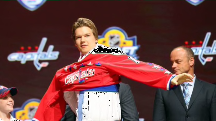
I think the original photos of these jerseys were not good to say the least. I think the photographer had a bad night and a rougher morning or something because the lighting was awful, the waist stripe looked massive and he made Ovechkin look 1000lbs.
When the Capitals actually wore these, I thought they looked so good. The Navy blue with the white shoulder yoke was a great touch, and it went great with the last name and number font.
The only issue I have is the “Caps” logo. I think they made it look nice, but I don’t think a nickname should ever be on the front of a jersey. I feel these are the most underrated jerseys the Capitals have ever worn.
#4 – The Adidas “Adizero” Home Jersey
When these were first revealed, I thought the new navy blue piping and the white on the inside of the arms looked a little strange. The Capitals also fell victim to the weird collar and shoulders Adidas added to every team’s jersey. However, these have grown on me quite a bit.
I think it’s safe to say that watching the Washington Capitals win their first Stanley Cup in franchise history in this set of uniforms (even though it was actually their road sweaters).
I still don’t love the collar but I think it too grew on me. I still think the shoulders are a bit weird. My one problem with these jerseys is the shoulder logos. I can’t explain it at all but for some reason, they look cheaper on these jerseys than the Reebok ones.
That is completely personal and just a crazy reason, but I felt I should mention it. I do think maybe the Capitals should switch up their current set of uniforms sometime in the near future, but I can’t lie and say I wouldn’t miss this style of Capitals jersey. An all-time classic.
#3 – The 2015 Winter Classic Jersey
Coming in at number three are these sweaters the Caps wore in the 2015 Winter Classic where they defeated the Chicago Blackhawks 3-2 after a game-winning goal from Troy Brouwer with 13 seconds left.
These are incredibly nice jerseys. The choice of burgundy, which is unique in terms of colours seen on a Caps jersey, really looks nice with the original white striping pattern seen on the shoulders and waist of the sweater.
Perhaps my favourite aspect of the entire uniform is the logo on both the centre of the jersey and the leg of the pants. The W with three stars above it is a really great looking logo that the Capitals really should utilize more in future jerseys.
#2 – The 2011 Winter Classic Jersey
I feel as though I have to put these on the list and put them high. I absolutely loved these jerseys when they were released, but since then, if I’m being completely honest, they have lost some steam to me.
I think the Reebok collar doesn’t look great on these, and it bothers me how small the red shoulder yoke is. I know that is incredibly minor and nitpicky, but it is just something I have noticed as the years have gone by.
That being said, I still can’t deny how sharp these jerseys are and were a great homage to the Capitals’ jerseys of old. I do, however, prefer the reds to these whites. Which leads us to number one on the list…
#1 – The 2018 Retro Thirds
I know, these seem to be cursed…but how can these not be the best jerseys the Capitals have ever worn?
All of the colours just work together so well, and the accent of the stars really helps represent D.C. as the capital of the United States. These Adizero-style versions of the jersey are great.
Unlike a lot of other teams, the collar on these Adizero jerseys is perfect, leaving it simply white all the way around (see the New York Islanders jersey for the worst collar in the NHL).
As previously mentioned, I do not love the Adizero shoulders but I think they look decent on this sweater. My only complaint with these jerseys, and the problem I have with the possibility of them switching to these full-time, is the logo.
Yes, I love how vintage it is and for that exact reason, it is a great third. But the logo is just too old to be a modern NHL team’s logo. Maybe a jersey with a similar pattern with the Weagle at the centre? One can only dream.
Conclusion
Well, there you have it. My personal list of the top 5 jerseys in Washington Capitals history. I know some, if not all of you will disagree. I may have lost some fans. I may lose friends and family. I’d be stunned if I don’t receive death threats. But that would all be worth it to know that I got my truth out there to the world.
The Capitals have had some pretty nice jerseys in the past, but also some pretty terrible ones too; As I am sure every team in the NHL has. Let’s hope their next sweaters, whenever they choose to add a new one, fall under the “pretty nice” category. More than that, let’s hope I’m still alive to comment on them after this article goes live.