The Washington Capitals have had some dope logos over the years, none being more dope than the screaming eagle. So today we’re going to break down all the logos in Caps history and tell you which ones are the best besides that one.
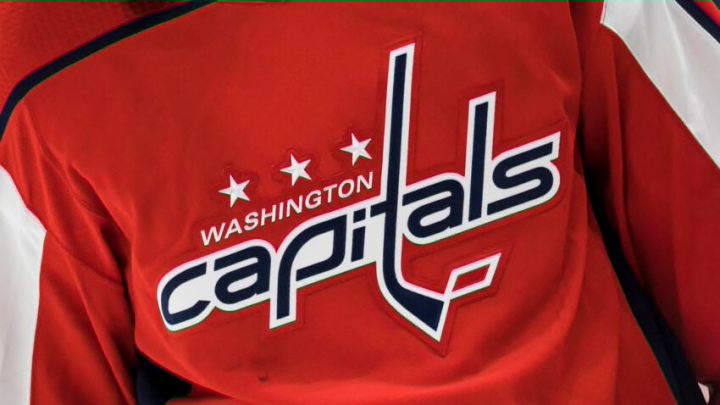
The logos from the first season and the current logo today are very similar. In 1974-75 through 1994-95 as well as 2007-08 through the present. The only similar things were the red Washington in lowercase. The Capitals in lowercase in the old school jerseys was a lighter blue while the current logo features three stars representing the DMV (D.C., Maryland, Virginia).
In 1995-96 through the next season as well as 1997-98 through 2001-02 their primary logo was the screaming eagle. The only difference was that 1995-96 through 1996-97 had Capitals next to the eagle.
2002-03 through 2006-07 was the Capital dome. Then it’s been lowercase Washington Capitals ever since. The Capital dome was the alternate logo from 1995-96 thought 2001-02 while the Weagle is the current alternate logo since 2007-08.
The Caps have also taken their logo to the W level during both the 2015 Winter Classic and the last two seasons and one more season this upcoming year with their alternate blue jerseys.
The Caps also used the blue jersey concept during the 2018 Stadium Series with the jerseys spelling out Caps. This upcoming season has the Caps playing in Raleigh for the Stadium Series. We have yet to know what kind of jersey or logo concept we’ll get but we’re excited to see.
The NBA has City Edition. The MLB has City Connect. While the NHL doesn’t have a city edition type of thing for their jerseys there’s a promise that the reverse retro is coming back this season.
That was a success in the 2021 COVID shortened season where we sadly only got to see the Capitals wear those screaming eagle beauties four times. But the screaming eagle promises to come back in the form of a black jersey this time. Should be sick or as today’s kids would say “tuff”.
