The best sweater to ever to bless the chests of our boys is undeniably the Screaming Eagle, including Screaming Eagle (Taylor's version). Opposing viewpoints will not be entertained at this time. Honestly, every team's black uniform colorway always looks the hottest. Even that Dallas atrocity with the neon green.
Unfortunately, we are spoilt for choice when it comes to worst in the Capitals walk-in closet. It is not an entirely unforeseeable consequence of a team name that essentially references a parcel of land - animals and shapes are much easier.
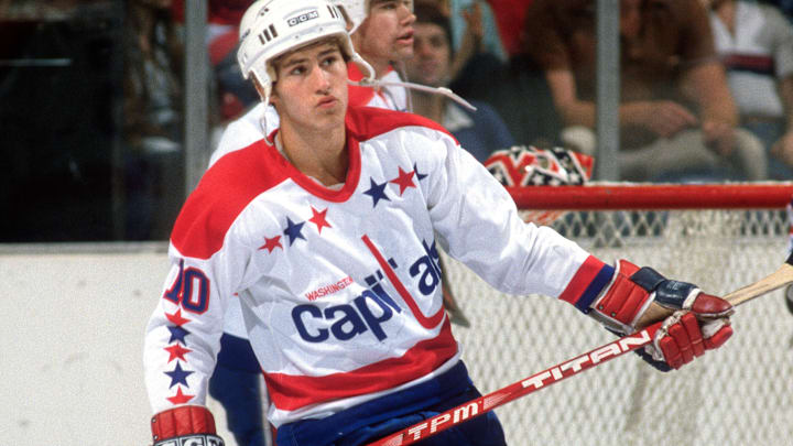
While we are fans of the stars and sticks here at Stars and Sticks, the 1981 iteration of this design has the misfortune of basically reading CapiLals. The afterthought 'Washington' isn't helping either. No objection to the stars. It's all well and good to be one of the only designs with a puck incorporated, but it simply doesn't make up for graphic illiteracy.
Almost unforgivably, the team wore white pants in the first four road games of their very first season until someone very sensible remembered you can't wear white after Labor Day, and they're kind of see-through for guys that spend a fair amount of time leaning over. I have to admit that the gloves are kind of great though - let's bring those back.

In the grand scheme of terrible jersey design the Capitals are thankfully nowhere near the worst in the league. If we had to make a version that only read 'caps' to avoid the 'L' problem then so be it; my inner nerd is super amused that they did it in all lower-case though. I feel like the fandom could really do something with CAPS LOCK as a spin off of #ALLCAPS if they ever decide to rethink that.
Here's to more eagles, Caps in CAPS, and ideally a 2015 Winter Classic throwback.
